Calming Colours: What Actually Soothes the Eye, and Why
What are the most calming colors? What research says about blue, green and lavender, why saturation matters more than hue, and how to use colour to unwind.
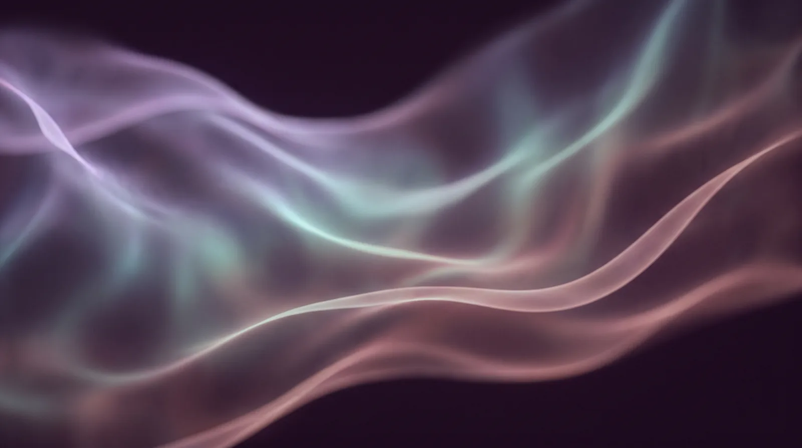
Ask anyone to name a calming colour and you will hear the same small litany: blue, green, perhaps lavender if they are feeling adventurous. The intuition is ancient and apparently universal. Hospitals paint their corridors in watery greens; spas drench themselves in seafoam; nobody has ever marketed a meditation app in traffic-cone orange. And yet the science of colour and mood, when you actually open the cupboard, is subtler and more interesting than the folklore. The short version: the folklore is not wrong about blue, but it is looking at the wrong dial. What soothes the eye is less a matter of which colour than of how much.
What the research actually shows
Colour psychology has a chequered past, full of confident Victorian claims and unreplicable modern ones, so it pays to stand on the firmer stones. One frequently cited experiment placed students in differently coloured environments and tracked emotion, heart rate and performance, finding that blue tones were associated with calmer readings and more relaxed self-reports than vivid warm colours (Al-Ayash, Kane et al., 2016, Color Research and Application). A major review of the field's history is franker still: colour does reliably influence feeling and behaviour, but the effects depend heavily on context, and on dimensions beyond hue (Elliot, 2019, Review of General Psychology). In other words: yes, colour matters; no, there is no single magic wavelength of serenity.
The most practical finding hiding in that literature concerns saturation and brightness. Pale, soft, low-saturation colours of almost any hue read as calm; intense, highly saturated colours of almost any hue read as arousing. A dusty rose soothes where a fire-engine red alarms, though both are red. A muted teal settles where an electric cyan jangles, though both are blue. When people say blue is calming, much of what they mean is that the blues we meet in nature, sky at dusk, deep water, distant hills, are almost always soft, desaturated and dim. It is the softness doing the soothing, with the hue in a supporting role.
There is no single magic wavelength of serenity. It is the softness doing the soothing.
What the traditions knew
Contemplative cultures arrived at these findings some centuries ahead of the laboratories. Chinese shan shui painting renders whole mountain ranges in diluted ink, greys and silvery washes, precisely because the muted palette invites the mind to settle rather than grasp. Tibetan visualisation practices assign colours to states of mind and ask the practitioner to bathe attention in them slowly. The stained glass of Gothic cathedrals was engineered, quite deliberately, to drench interiors in dim blue light that hushed the crowds who entered. And every culture with a word for dusk has noticed the particular peace of that hour, when the world's palette drops its saturation all at once, as though the day itself were exhaling.
Using colour deliberately
All of this converts readily into evening practice. A few ways to put the palette to work:
- Soften the light an hour before bed: warm, dim lamps rather than overhead white, so the room itself drops into low saturation.
- Mute the screens you cannot avoid: night modes and lowered brightness shift a phone's palette from alarm to ember.
- Give the eyes one soft thing to rest on: a candle flame, a dim lamp through a linen shade, or a slow moving texture in muted colour. The deep aubergines, lavenders and dusk-blues of Feelsy's textures were chosen on exactly this principle: colours near the quiet end of the dial, moving slowly enough for the eye to settle into them.
- Notice the colours that calm you personally: the research describes averages, but association is powerful, and the grey-green of a grandmother's kitchen may outperform any laboratory blue for you alone.
A practice of looking
Beyond the furniture and the lamps, there is a simpler practice available: choose a calming colour and actually look at it, the way one looks at a painting rather than a wall. Sit comfortably, let a soft colour fill your view, a dusk sky, a dim screen of slow lavender, even a painted door, and let the eyes rest without searching. Colour, unlike text or faces, asks nothing of the mind: no reading, no recognising, no reply. Attention given to pure colour is attention on holiday, and a few minutes of it slows the evening down remarkably. In Feelsy we often suggest ending the day with a single texture in the deepest palette, screen dimmed, letting the colour do the work that counting sheep never quite managed.
Colour is the one aesthetic decision no one escapes: every room, every screen, every hour of light makes one for us. The research and the traditions agree more than they quarrel, and their shared advice is modest: choose softness over intensity in the hours before rest, give the eye colours it does not have to defend itself against, and treat the palette of your evening as part of the ritual of ending the day. The eye, given something gentle to rest on, is very good at taking the rest of us with it.
Feelsy is a wellness product, not medical advice. If stress, anxiety or sleep problems persist, please speak with a qualified professional.
References
- Al-Ayash, A., Kane, R. T., Smith, D., & Green-Armytage, P. (2016). The influence of color on student emotion, heart rate, and performance in learning environments. Color Research and Application, 41(2), 196-205.
- Elliot, A. J. (2019). A historically based review of empirical work on color and psychological functioning: Content, methods, and recommendations for future research. Review of General Psychology, 23(2), 177-200.
Frequently Asked Questions
What are the most calming colors according to research?
Blue tones are often associated with calmer readings and more relaxed self-reports in research, but the more important factor isn't hue at all, it's saturation and brightness. Pale, soft, low-saturation colors of almost any hue read as calm, while intense, highly saturated colors of almost any hue read as arousing.
Is it the color blue itself that's calming, or something else?
The article argues it's mostly the softness, not the specific hue. When people say blue is calming, much of what they actually mean is that the blues found in nature, like sky at dusk or deep water, are almost always soft, desaturated, and dim. A dusty rose can soothe where a fire-engine red alarms, even though both are technically red.
Did older cultures understand calming colors before modern research?
Yes, several traditions arrived at similar conclusions long before laboratories did. Chinese shan shui painting uses diluted ink and silvery washes specifically because muted palettes invite the mind to settle, and Gothic cathedral stained glass was deliberately engineered to drench interiors in dim blue light that hushed crowds entering.
How can I use color to help myself relax in the evening?
Soften the light an hour before bed with warm, dim lamps instead of overhead white light, mute your screens using night modes and lowered brightness, and give your eyes one soft, muted thing to rest on, like a candle flame or a slow-moving texture in low saturation colors. Paying attention to which colors calm you personally also matters, since association can outperform any general research finding.
About the author
Contributing writer
Eleonor writes about contemplative traditions, attention and the cultural history of calm. She has spent two decades collecting the rituals humans use to slow down, from zazen halls to hammams, and translating them for modern, screen-lit lives.
Feel it for yourself.
Feelsy turns reading about calm into practising it. Two minutes of a slow texture is often the whole difference.


Related reading
 Visual Meditation
What Is Visual Meditation? The Complete Guide
Visual meditation rests your attention on slow, pleasing motion so calm happens almost on its own. Here is how it works, what the research says, and how to practise it in three minutes.
 Ancient Wisdom
Trataka: The Original Visual Meditation
Centuries before screens, yogis rested their gaze on a single candle flame. How trataka works, how to practise it safely, and what it teaches modern visual meditation.
 Ancient Wisdom
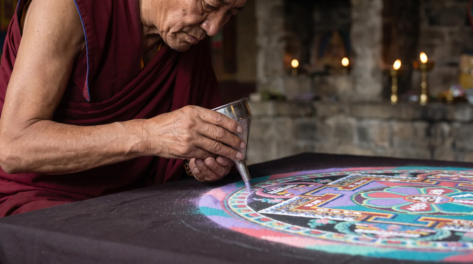
Sand Mandalas and the Art of Letting Go
Tibetan monks spend days building an intricate sand mandala, then sweep it away. What the ritual teaches about impermanence, process and why watching can be meditation.
 Visual MeditationNew
Highway Hypnosis: Why You Can't Remember the Last Ten Miles
You arrive at your exit with no memory of driving there. Highway hypnosis is real and common: here's the science of the road trance and how to use it safely.
 Visual Meditation
Why the Northern Lights Mesmerise Us: Aurora Watching as Visual Meditation
What causes the northern lights, why the aurora feels so calming to watch, and how to turn sky watching into a simple visual meditation practice.
 Visual Meditation
Blue Mind: Why Being Near Water Calms the Brain
What blue mind theory says about why oceans, lakes and rivers soothe us: the research on blue space, water's pull on the eye, and how to use it daily.